The world of creatives – you gotta love it. Beautiful redesigns are making their way to the surface of web more and more as the days tick by. Some of the UX designs that pop up are captivating and really very interesting to absorb and understand. All it takes is a creative mulling over the latest design of one of the most popular apps amongst smartphone users, and out of nowhere inspiration sparks a glorious flat design concept piece. Recently, some of the best out there to be redesigned are the likes of Snapchat and someone has even taken a stab at a redesign of Adidas – not that it necessarily needs it, it’s just an interesting brand to see redeveloped and reimagined.
So, taking a closer look at the scene, you start to notice a similar design pattern amongst the creative community looking to disrupt the makers and shakers of app design and development. They all tend to be in a very flat concept. This is a style that is flooding through the design communities more and more, making a huge impact on reconditioning our perception of new and popular apps.
A design that has been capturing the attention of many avid user is the Instagram app pictured below. This is an amazing piece that really makes you believe this could be the next design for the photo sharing giant.
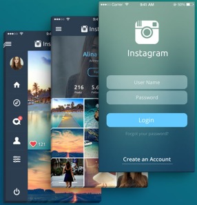 The designer, who is from Kosovo, has taken it upon himself to create this re-imagination saying he was “bored” with the current one as the reason why he embarked upon doing so. As you can see from his design, he has taken a stab at redesigning the user interface and the logo as an all-in-one design piece. The Logo has turned from a full colour design to a plain white aesthetic, and this is mirrored throughout the app very clearly.
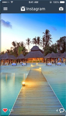 A feature that really makes the design stick out is the reposition of the menu. It gives the illusion of a completely new app, very streamlined and very clean. And very beautiful.
Go and see the full extent of the design!
What are your thoughts on this piece of work? – Visit the original post here

